30: Regression Analysis
Goal: Discuss the validity of regression models
Objectives:
- explore nonlinear regression models
- practice using the coefficient of determination
Setting
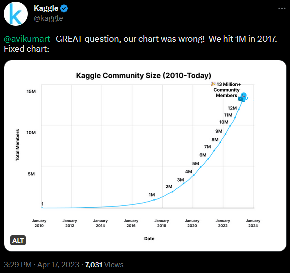
Kaggle was founded in April 2010 and is a data science resource that hosts many public data sets and hosts machine learning competitions.
- predictor variable
\[X: \text{months since founding}\]
- response variable
\[Y: \text{number of users (in millions)}\]
Data
This data set is relatively small, so we can quickly transcribe it into an R data frame.
df <- data.frame(
  months = c(0,86, 101, 110, 118, 123, 129, 134, 139, 143, 147),
  users = 0:10
)
Source: https://www.kaggle.com/discussions/general/332147
Linear Model
\[\hat{y} = a + bx\]
In model equations, the response variable is listed first
\[\sim \quad \text{:} \quad \text{explained by}\]
then the predictor variables.
linear_model <- lm(users ~ months, data = df)linear_model
Call:
lm(formula = users ~ months, data = df)

Coefficients:
(Intercept)       months
   -2.38965      0.06609
Prediction
Example: As of this writing (April 2023), there have been 156 months since Kaggle was established. Use a linear regression model to predict how many users are on Kaggle.
predict(linear_model, newdata = data.frame(months = 156)) 1
7.919814 Data Visualization
In ggplot2, the geom_smooth layer can quickly graph the linear regression model.
`geom_smooth()` using formula = 'y ~ x'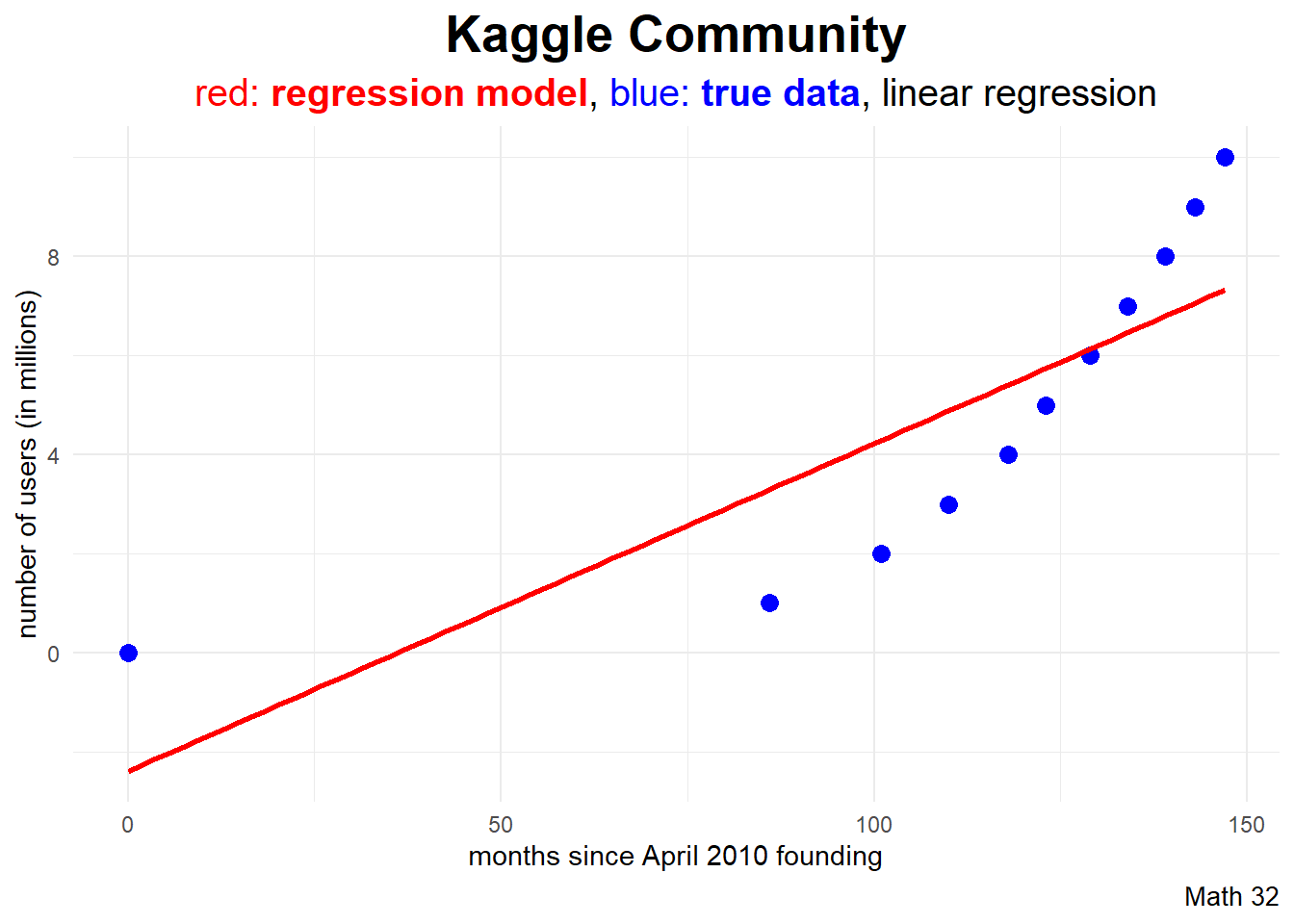
subtitle_string = "<span style='color:#FF0000'>red: <b>regression model</b></span>,
<span style='color:#0000FF'>blue: <b>true data</b></span>"

df |>
  ggplot(aes(x = months, y = users)) +
  geom_point(color = "blue", size = 3) +
  geom_smooth(color = "red", method = "lm", se = FALSE) +
  labs(title = "Kaggle Community",
       subtitle = subtitle_string,
       caption = "Math 32",
       x = "months since April 2010 founding",
       y = "number of users (in millions)") +
  theme_minimal() +
  theme(plot.subtitle = element_markdown())
Quadratic Regression
\[\hat{y} = a + bx + cx^{2}\]
By default, R uses orthogonal polynomials in model creation. If we would rather gather easy-to-interpret coefficients in the model form above, use raw = TRUE.
d2_model <- lm(users ~ poly(months, 2, raw = TRUE), data = df)d2_model
Call:
lm(formula = users ~ poly(months, 2, raw = TRUE), data = df)

Coefficients:
                 (Intercept)  poly(months, 2, raw = TRUE)1
                     0.06293                      -0.08169
poly(months, 2, raw = TRUE)2
                     0.00100
Example: As of this writing (April 2023), there have been 156 months since Kaggle was established. Use a quadratic regression model to predict how many users are on Kaggle.
predict(d2_model, newdata = data.frame(months = 156)) 1
11.66495 Data Visualization
In ggplot2, the geom_smooth layer can quickly graph the polynomial regression model.
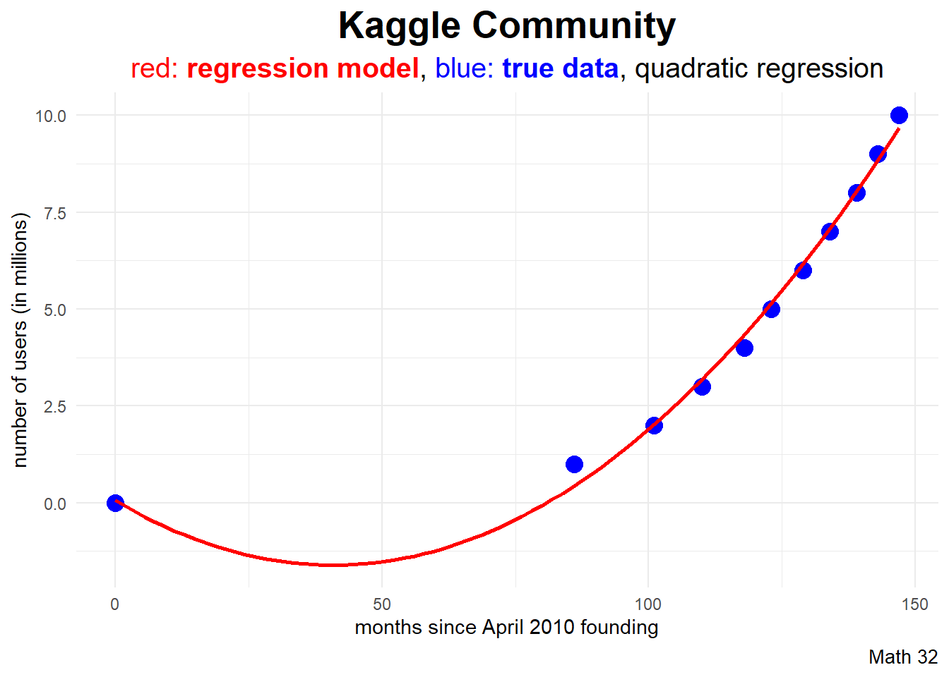
subtitle_string = "<span style='color:#FF0000'>red: <b>regression model</b></span>,
<span style='color:#0000FF'>blue: <b>true data</b></span>, quadratic regression"

df |>
  ggplot(aes(x = months, y = users)) +
  geom_point(color = "blue", size = 4) +
  geom_smooth(color = "red",
              formula = y ~ poly(x,2, raw = TRUE),
              method = "lm",
              se = FALSE) +
  labs(title = "Kaggle Community",
       subtitle = subtitle_string,
       caption = "Math 32",
       x = "months since April 2010 founding",
       y = "number of users (in millions)") +
  theme_minimal() +
  theme(plot.title = element_text(face = "bold",
                                  hjust = 0.5,
                                  size = 20),
        plot.subtitle = element_markdown(hjust = 0.5,
                                         size = 15),
        plot.caption = element_text(size = 10))
Cubic Regression
\[\hat{y} = a + bx + cx^{2} + dx^{3}\]
By default, R uses orthogonal polynomials in model creation. If we would rather gather easy-to-interpret coefficients in the model form above, use raw = TRUE.
d3_model <- lm(users ~ poly(months, 3, raw = TRUE), data = df)d3_model
Call:
lm(formula = users ~ poly(months, 3, raw = TRUE), data = df)

Coefficients:
                 (Intercept)  poly(months, 3, raw = TRUE)1
                   1.360e-03                     1.485e-02
poly(months, 3, raw = TRUE)2  poly(months, 3, raw = TRUE)3
                  -6.207e-04                     6.691e-06
Example: As of this writing (April 2023), there have been 156 months since Kaggle was established. Use a cubic regression model to predict how many users are on Kaggle.
predict(d3_model, newdata = data.frame(months = 156)) 1
12.61522 Data Visualization
In ggplot2, the geom_smooth layer can quickly graph the polynomial regression model.
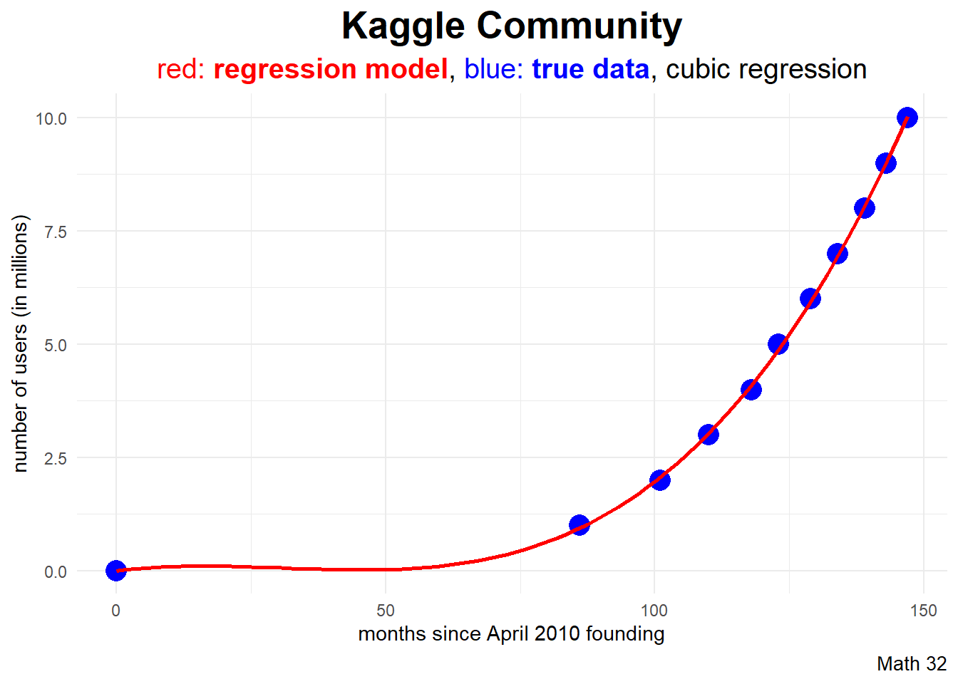
subtitle_string = "<span style='color:#FF0000'>red: <b>regression model</b></span>,
<span style='color:#0000FF'>blue: <b>true data</b></span>, cubic regression"

df |>
  ggplot(aes(x = months, y = users)) +
  geom_point(color = "blue", size = 5) +
  geom_smooth(color = "red",
              formula = y ~ poly(x,3, raw = TRUE),
              method = "lm",
              se = FALSE) +
  labs(title = "Kaggle Community",
       subtitle = subtitle_string,
       caption = "Math 32",
       x = "months since April 2010 founding",
       y = "number of users (in millions)") +
  theme_minimal() +
  theme(plot.title = element_text(face = "bold",
                                  hjust = 0.5,
                                  size = 20),
        plot.subtitle = element_markdown(hjust = 0.5,
                                         size = 15),
        plot.caption = element_text(size = 10))
Analysis of Variance
- denote \(y_{i}\) for true outcomes
- denote \(\hat{y}_{i}\) for estimates (or predictions)
- then \(y_{i} - \hat{y}_{i}\) is the \(i^{\text{th}}\) residual
\[SS_{\text{res}} = \displaystyle\sum_{i=1}^{n}(y_{i} - \hat{y_{i}})^{2}\]
\[SS_{\text{tot}} = \displaystyle\sum_{i=1}^{n}(y_{i} - \bar{y_{i}})^{2}\]
Variation
\[R^{2} = 1 - \displaystyle\frac{SS_{\text{res}}}{SS_{\text{tot}}} = \displaystyle\frac{\text{explained variation}}{\text{total variation}}\]
- for linear regression, \(R^{2}\) is the square of correlation
- range of \(R^{2}\) is \([0,1]\)
- higher \(R^{2}\) implies better model
Adjusted Coefficient of Determination
To later mitigate issues such as the curse of dimensionality in more complex models, statisticians recommend use of an adjusted \(R^{2}\) such as
\[R^{2} = 1 - \displaystyle\frac{SS_{\text{res}}}{SS_{\text{tot}}} \cdot \displaystyle\frac{df_{\text{tot}}}{df_{\text{res}}}\]
summary(linear_model)
Call:
lm(formula = users ~ months, data = df)

Residuals:
    Min      1Q  Median      3Q     Max
-2.2938 -1.6442 -0.1355  1.5715  2.6750

Coefficients:
            Estimate Std. Error t value Pr(>|t|)
(Intercept) -2.38965    1.78199  -1.341  0.21278
months       0.06609    0.01503   4.398  0.00172 **
---
Signif. codes:  0 '***' 0.001 '**' 0.01 '*' 0.05 '.' 0.1 ' ' 1

Residual standard error: 1.97 on 9 degrees of freedom
Multiple R-squared:  0.6825,    Adjusted R-squared:  0.6472
F-statistic: 19.35 on 1 and 9 DF,  p-value: 0.001724
Exponential Regression
\[\hat{y} = a*b^{x}\]
# shouldn't compute ln 0
df$users[1] <- 0.1

exp_model <- lm(log(users) ~ months, data = df)
# coefficients of ln a and ln b
exp_model
Call:
lm(formula = log(users) ~ months, data = df)

Coefficients:
(Intercept)       months
   -2.44344      0.03226
Example: As of this writing (April 2023), there have been 156 months since Kaggle was established. Use an exponential regression model to predict how many users are on Kaggle.
a <- exp(summary(exp_model)$coefficients[1])
b <- exp(summary(exp_model)$coefficients[2])
a*b^{156}
[1] 13.31783Data Visualization
In ggplot2, the geom_function layer can quickly graph a custom function.
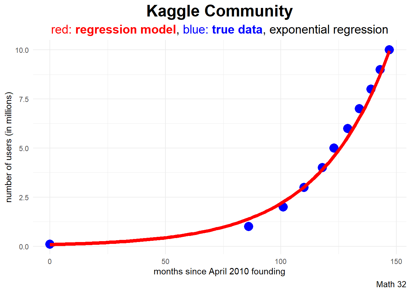
subtitle_string = "<span style='color:#FF0000'>red: <b>regression model</b></span>,
<span style='color:#0000FF'>blue: <b>true data</b></span>, exponential regression"

f <- function(x) { a*b^x }

df |>
  ggplot(aes(x = months, y = users)) +
  geom_point(color = "blue", size = 5) +
  geom_function(fun = f, color = "red", linewidth = 2) +
  labs(title = "Kaggle Community",
       subtitle = subtitle_string,
       caption = "Math 32",
       x = "months since April 2010 founding",
       y = "number of users (in millions)") +
  theme_minimal() +
  theme(plot.title = element_text(face = "bold",
                                  hjust = 0.5,
                                  size = 20),
        plot.subtitle = element_markdown(hjust = 0.5,
                                         size = 15),
        plot.caption = element_text(size = 10))
Model Selection
Let us use the adjusted \(R^{2}\) values to judge our models.
summary(linear_model)$adj.r.squared[1] 0.6472128summary(d2_model)$adj.r.squared[1] 0.9923513summary(d3_model)$adj.r.squared[1] 0.9994897summary(exp_model)$adj.r.squared[1] 0.9899031What Happened
On April 17, 2023, Kaggle surpassed 13 million users!
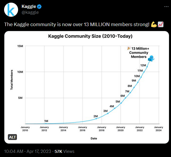
predict(d3_model, newdata = data.frame(months = 156)) 1
12.61522 Looking Ahead
- WHW10
- LHW9
Final Exam will be on May 6
- more information in weekly announcement
